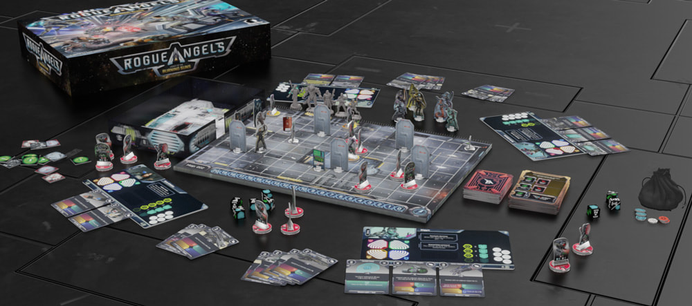
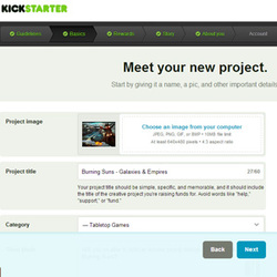
 Good day to you all, I've wanted to talk to you about this for a while, because I think it is quite a challenge to do right, and in the end it was probably what I got the most positive feedback for concerning my campaign as a whole (of topics not related to the game of course). I'll try to go through the different visual aspects of the layout - and not the content itself, since I've already been through some of that in another post. I hope you'll enjoy :) If you want to see the Kickstarter campaign, take a look here: http://www.kickstarter.com/projects/1874487592/burning-suns-the-conquest-of-a-galaxy 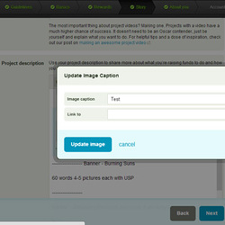 Creating the visuals for Kickstarter First thing first - You want to create all these goodies in a nice tool like Photoshop, Paint.NET, Illustrator or similar. You have to remember the primary size (640px) of the Kickstarter board, in where you can put your pictures. The board will only expand downwards - which it quickly will - due to the nature of the Kickstarter campaign ;) You want your pictures to go nicely on the plain white background that Kickstarter uses. You don't have that many options with you visual layout through the Kickstarter campaign tool. What you can do is creating links and text connected with your pictures.  The titles and/or banners One of the first things you want to do - is creating some nice looking banners for your titles or sections of the Kickstarter campaign. First of all it makes it easy for you to overview your campaign while building it, and it'll guide your backers through the campaign - so they are worth a long time of revisiting. "In picture separation" One thing I've done that I think works very well is to separate the text sections by a banner which has a differentiate white/empty space on top and bottom. The reason is that Kickstarter won't allow for empty space in the campaign, which means that it's reduce all multiple <breaks> to single <breaks>. Squeezing everything together. By doing this manually in the picture itself - you're creating a better illusion of dividing content into separate sections - instead of everything being squeezed together. Making some room between objects will relax the reader a bit - not getting overwhelmed by too much information at a time. "Less is more" 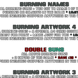 Text effects One thing I've been very fond of was different effects on text. It can look very nice on the right backgrounds and in the right context.... but it's also very easy to get carried away. My advice is not to use special text effects when writing something on the white Kickstarter board. Keep it simple and sharp, not everyone is visiting the campaign from a laptop or is equipped with eagle eyes ;) Remember not to put your text on festival backgrounds either, where it's hard to make out and focus on the text. 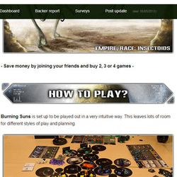 Theme Keep your graphical pieces within the theme. That meaning banners, price tags, icons and so on. The rest of your presentation will be filled with the theme of your game - so make sure you're layout is too. I still need to work on that for sure - and I know I'm going to come up with some even nicer looking banners for the next Kickstarter. I think it's important if you want the backers to be sucked into your world. Remember to use pictures and illustrations from your game - in a way that makes sense. It could be to give each pledge level a character cards from the deck of commanders (if you have such) or let different shipping cost be portrayed with different space ships. There are many things you can do, as long as you stick to the "easy to read/understand" concept :) 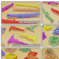 Clean cut I think it's important to keep the layout uniform in every way possible. Don't use 12 different font colors or 6 different picture layouts. Always seek to create some easy to recognize shapes or colors, that will guide the backer from one part to another and back again. The quicker and easier a backer can find the information he/she needs - to more plausible it is that the backer will stay interested and actually ending up backing your project. I know I still have a long way to go from here :) There are of course many other things affecting the decision of a backer - and the faster you can deliver the deciding factors in a form that's easy to comprehend and go through, the more likely you are to get backed. Well, that's all for now - I hope these pointers will help you with your own Kickstater project :) Happy gaming - with the best regards from me! PS: Remember to sign up for my newsletter with Kickstarter and game alerts! 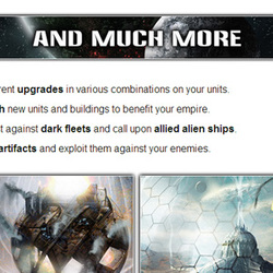 Hey Kickstarters and board gamers, Today I want to talk about the the content of my last Kickstarter campaign vs. the new campaign I'm building. I'll talk about this because I got so much positive feedback on my last campaign, and yet still didn't manage to get all my messages through to my backers. As you'll notice with all of my articles about Kickstarter - you can easily find campaigns that contradict my logic towards the subjects when it comes to success/failure. This is because you have to take so many other factors into account (famous designers, already established companies, viral effects, miniatures*). When you look closer, you'll usually find one of these factors to be a more deciding than the absent of the others. Be aware that this will also not be factors that you can calculate on to the same extent as doing your pre-production of the campaign properly. * Especially miniatures - above all else :D 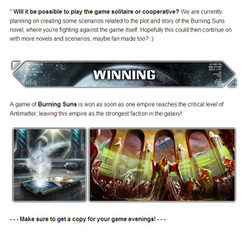 Kickstarter advises and my experience The Kickstarter team advises you on many points about what your campaign should contain, which is great. What you need to do - is to take that information and streamline it towards your audience. Many things have changed during the last couple of years - and one of the fundamental things is backers perception of a project on Kickstarter (especially board games/computer games). Here are the subjects I had laid out in my campaign, below the video of course (want to check out the campaign? Find Burning Suns here).
PROS: I had almost no questions to the campaign in general. Lots of comments on different aspects, but there were no questions to the campaign, what I wanted to do with the fundings or where I expected to get things printed etc. PROS: I didn't have to use my FAQs section of the campaign, which I thought was a very nice thing. No; "whooopsy, I forgot to tell you that...." CONS: The campaign page got very long and it was hard to point out specific sections for backers in updates or comments. CONS: It was hard to update the project page itself with new stuff, without cramming things even more together. 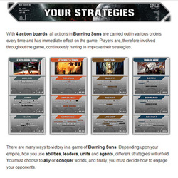 My future Kickstarter project's layout No doubt that my future Kickstarter projects will be shorter in total amount of "sections", put I also want to reorganize the chronology of them. Though it's not final - The layout/setup will be something like this.
 How to shorten the layout Kickstarter campaign? There are of course many tricks to shorten your campaign, just like a journalist knows how to shorten or lengthen a news story. Some of the ideas I'm going to use.
Final thoughts
It's hard not to get caught up in "how great your project is", and how much you want to share all your thoughts with your backers, friends and family. But you really have to kill your darlings! Like me you've probably spend between 1-3 years killing board game darlings on a weekly basis to end up with the product you have now. Now you have to kill your Kickstarter darlings - if you want to see it through to the end :) Happy gaming and kickstarting out there! Best regards Emil |
Kickstarter StudySharing my thoughts, ideas and lessons learned from my Kickstarter projects. Categories
All
|
 RSS Feed
